Cafe Branding
Instagrammable Coffee Cups: How Custom Cup Design Helps Cafes Earn More Shares
A practical guide for coffee shops on using custom coffee cup design to create a more recognizable brand, encourage customer photos, and turn everyday takeaway orders into social media moments.
A coffee cup is one of the few pieces of marketing a cafe can place directly in a customer’s hand.
That matters because a cup does more than carry a latte. It moves through sidewalks, office desks, car cup holders, co-working spaces, hotel lobbies, and social feeds. When the design is plain, the cup disappears into the background. When the design is recognizable, photogenic, and aligned with the cafe’s personality, it can become part of the customer’s own story.
This is why custom coffee cups have become a practical branding tool for independent cafes, specialty coffee shops, bakeries, restaurants, and beverage brands. A well-designed cup can make the business look more established, help customers remember the brand, and give people a small visual reason to share what they ordered.
At Packur, we help food and beverage businesses create custom printed hot cups and custom cold drink cups that are built for daily service, not just for a photoshoot. This guide explains how coffee shops can think about cup design as part of brand experience and social media marketing.
Why Coffee Cups Are So Shareable
Coffee is already a social product. People take photos of their morning routine, a good latte, a pastry break, a remote work setup, a weekend walk, or a drink they picked up from a new neighborhood cafe. The cup is often the most visible brand asset in those photos.
Industry publications have noticed this shift. Fresh Cup has described branded cups as a way to support brand recognition, customer loyalty, social media marketing, and perceived quality. Packaging Europe has also written about how social media has changed packaging design, pushing brands to think about how products look when photographed and shared.
The takeaway for cafes is simple: if customers are already documenting coffee moments, the cup should be designed to look good in those moments.
What Instagram-Friendly Coffee Cups Have in Common
Recent Instagram searches around coffee cup design, custom coffee cups, cafe branding, and takeaway coffee show a few repeat patterns. The strongest posts are rarely just a logo slapped onto a white cup. They usually have one or more of the following traits.
1. A Clear Brand Mark
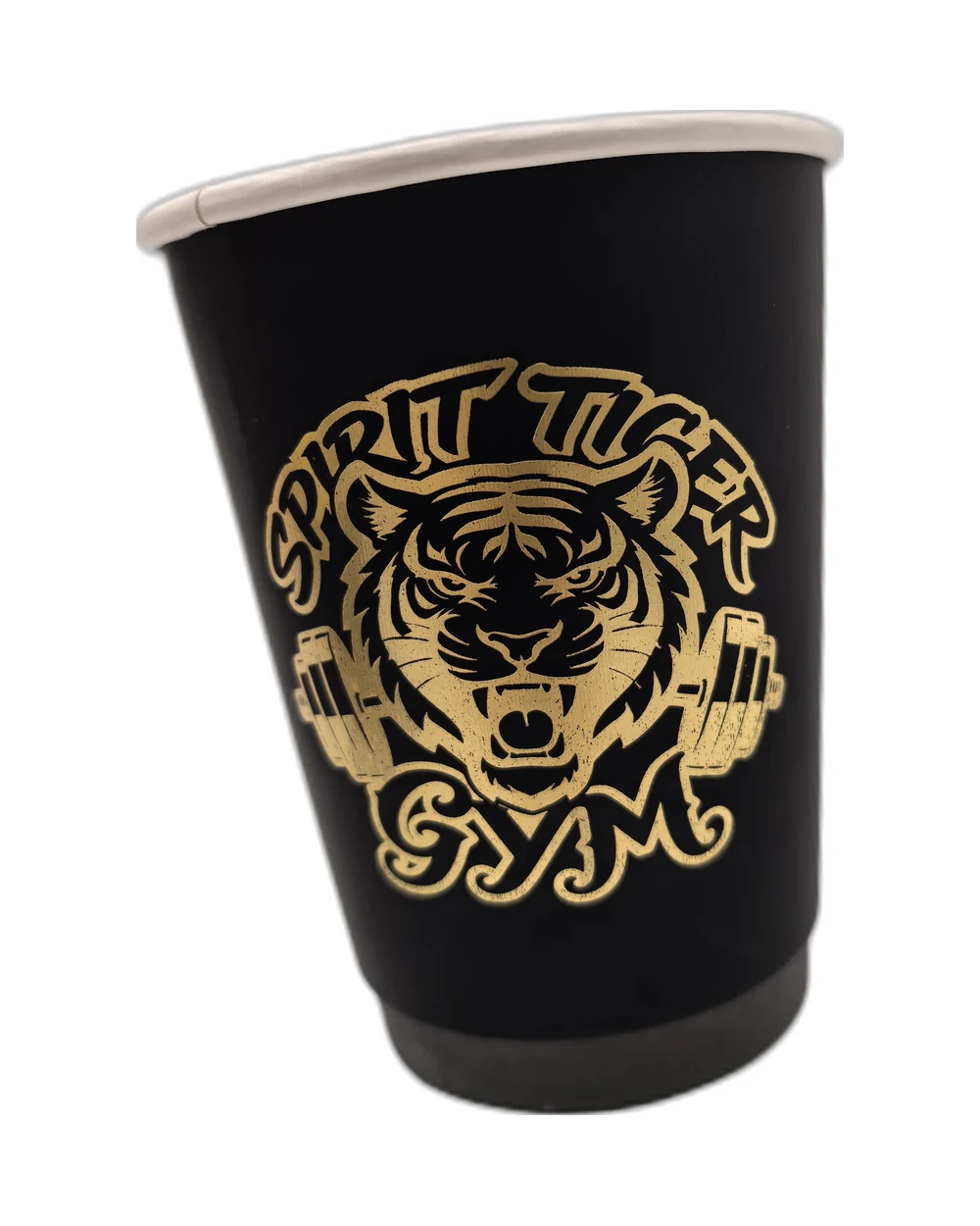
The logo or wordmark should be easy to recognize at phone-screen size. If the design only works when someone is holding the cup two inches from their face, it will not work well in a social photo.
For most cafes, this means:
- A strong front-facing logo placement
- Enough contrast between ink and cup color
- Simple typography that stays legible when photographed
- A design that still reads clearly when the cup is held at an angle
A small, tasteful logo can work, but only if the rest of the cup has a memorable visual language. If the cup is minimal, every detail needs to be intentional.
2. Color With a Point of View
Color is often what makes a cup stop the scroll. Some cafes use a single signature brand color. Others use seasonal palettes, limited-edition artwork, or contrasting lid-and-cup combinations.
The best color choices usually connect back to the cafe’s identity. A coastal cafe might use bright blue and cream. A bakery-cafe might use warm red, soft yellow, or illustrated pastry motifs. A modern espresso bar might use black, white, metallic ink, or one bold accent color.
The goal is not to be loud. The goal is to be recognizable.
3. A Design That Looks Good in Real Customer Settings
Your cup will not always be photographed under studio lighting. It may appear on a wooden counter, beside a pastry box, in a car, next to a laptop, or in a customer’s hand on the street.
Before approving a cup design, ask:
- Does it look good against the materials and colors inside the shop?
- Does it photograph well next to your food packaging?
- Does the logo stay visible when the hand covers part of the cup?
- Does the design work for both hot and cold drinks?
- Does the cup still feel like your brand when posted without a caption?
Good packaging design anticipates real use. It is made for the counter, the pickup shelf, the walk to work, and the camera roll.
4. Small Details That Invite a Closer Look
Some of the most engaging cup designs use a simple main mark plus a detail customers can discover: a tiny illustration, a short line of copy, a custom pattern, a neighborhood reference, or a rotating seasonal element.
These details give customers a reason to look twice. They can also make repeat visits feel fresh without requiring a total brand redesign.
Examples include:
- A small illustration near the base of the cup
- A pattern built from the cafe’s icon
- A seasonal message on the back panel
- A limited-edition color for holidays or local events
- A QR code that leads to a menu, loyalty program, or playlist
The detail should add personality, not clutter. A busy cup is harder to photograph and harder to remember.
5. Consistency Across the Takeout System
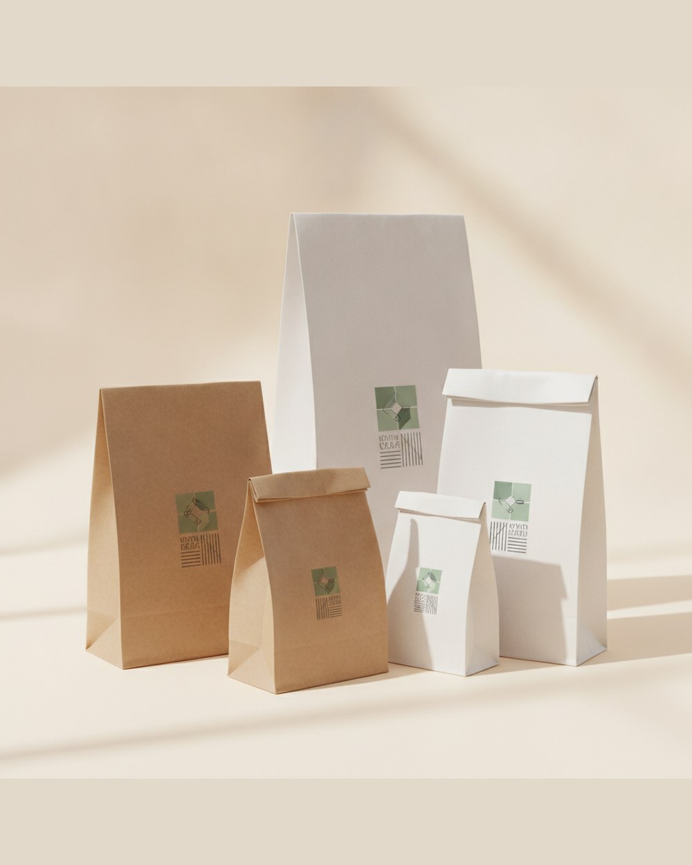
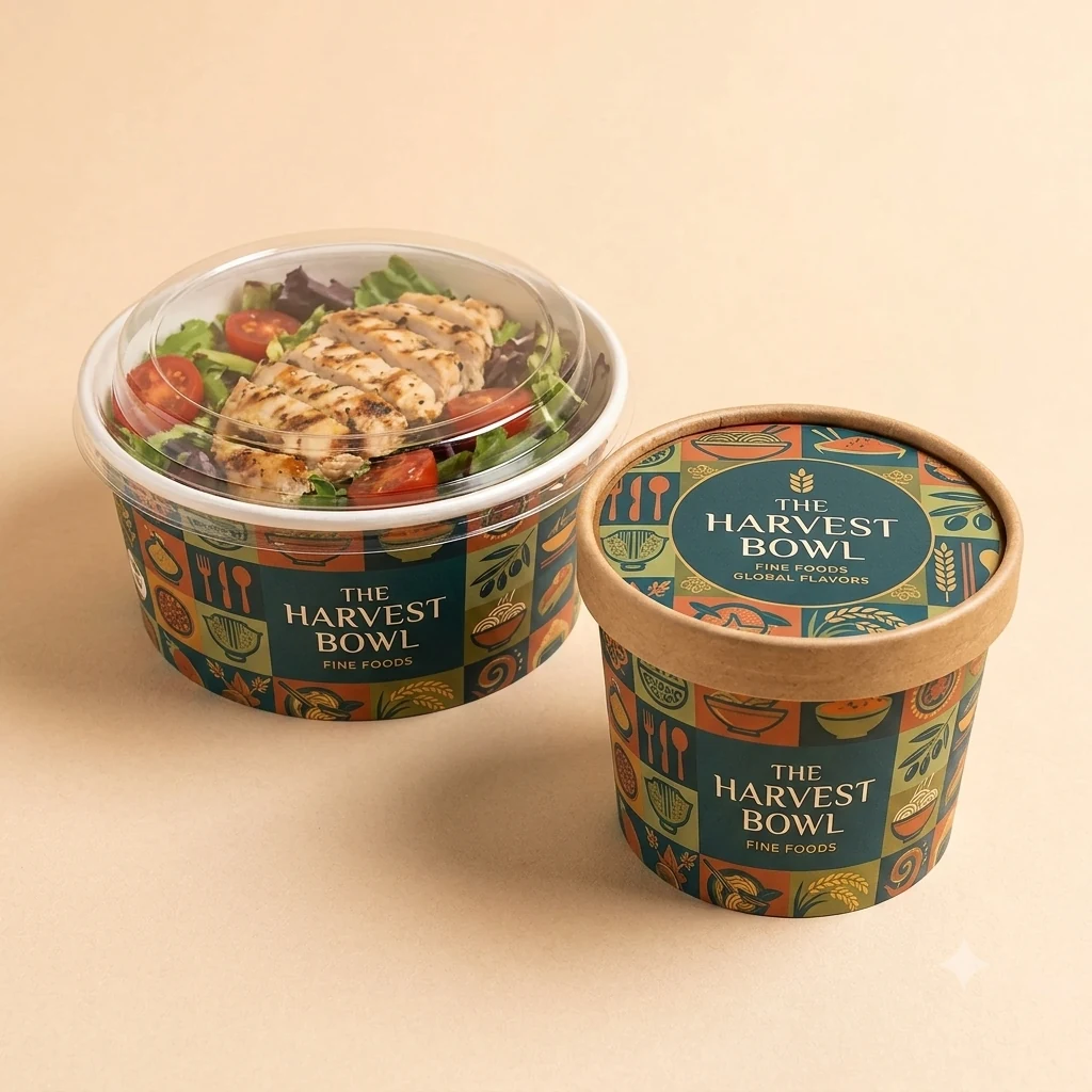
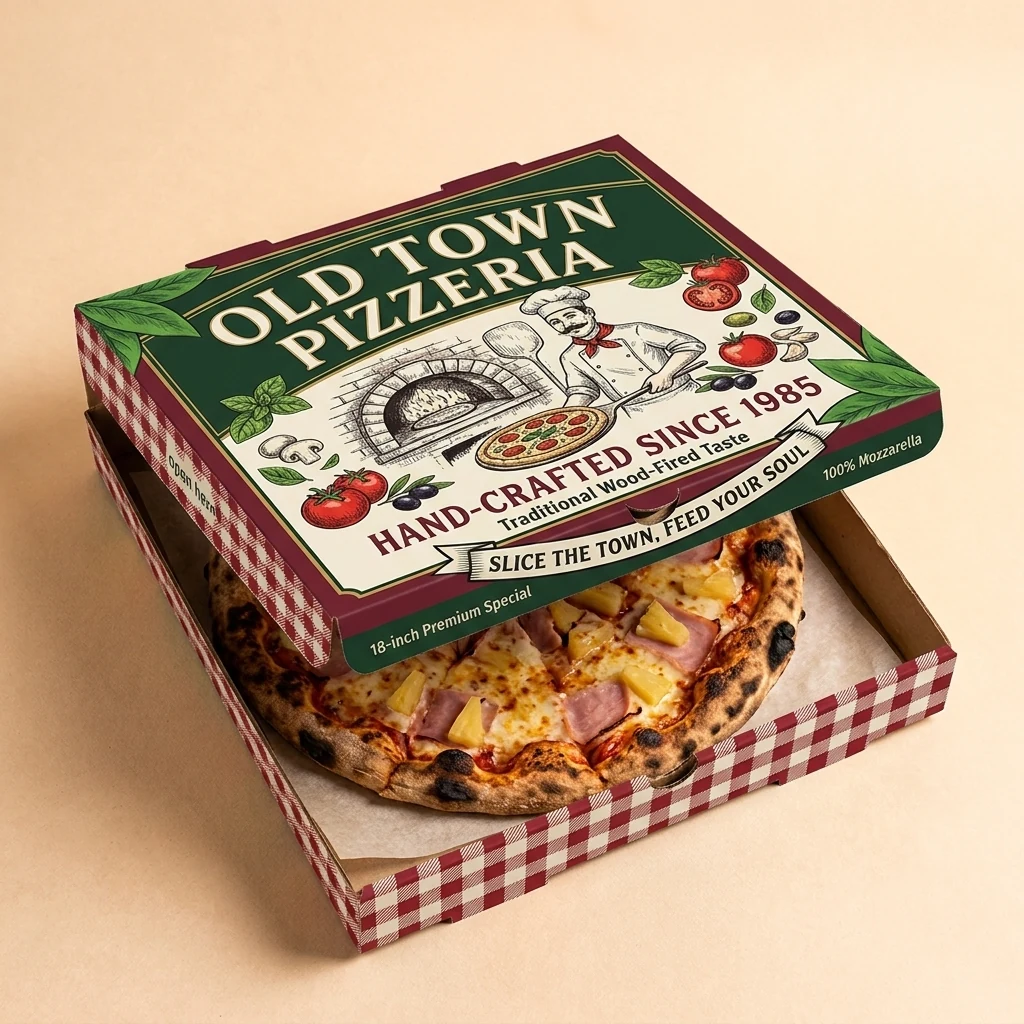
Coffee cups work harder when they match the rest of the packaging system. A hot cup, cold cup, sleeve, napkin, pastry bag, sticker, and takeout bag do not need to be identical, but they should feel like they came from the same brand.
This is especially important for cafes that sell pastries, breakfast sandwiches, desserts, or packaged retail coffee. A customer’s photo may include more than one item. Consistent packaging makes the whole order look more polished.
Packur can help cafes extend the same visual direction across custom cups, food papers, napkins, bags, labels, and takeout packaging so the brand feels consistent from the first sip to the last bite.
Design Ideas for Custom Coffee Cups
There is no single right style for a coffee cup. The best choice depends on your cafe’s brand, menu, location, and customers. These directions are a good starting point.
Minimal Logo Cup
Best for specialty coffee shops, premium espresso bars, and modern cafe concepts.
Use a clean logo, strong spacing, and restrained color. This style works well when the cafe already has a confident visual identity. The risk is becoming too generic, so the typography, cup color, or printing finish must be distinctive.
Illustrated Neighborhood Cup
Best for local cafes, tourist areas, bakeries, and community-driven brands.
Use small illustrations of landmarks, streets, plants, windows, bicycles, pets, or architectural details from the neighborhood. This can make the cup feel local and collectible.
Seasonal Cup Series
Best for cafes with active social media, holiday drinks, or rotating menus.
Keep the core brand elements consistent, then change color, pattern, or secondary artwork by season. Seasonal cups can give customers a reason to post again even if they already know the cafe.
Pattern-Based Cup
Best for brands with a strong icon, mascot, monogram, or visual motif.
Repeat a small element across the cup to create texture. This often photographs well because the design remains visible from multiple angles.
Message-Driven Cup
Best for playful cafes, student areas, office districts, and brands with a strong voice.
Use short copy that feels natural to the cafe: a morning greeting, a witty line, a values statement, or a phrase customers associate with the shop. Keep it short enough to read quickly.
Hot Cups vs. Cold Cups: Design Considerations
Hot and cold cups create different visual opportunities.
Hot cups are often photographed in hand, on counters, and beside pastries. Their shape makes front logo placement important. Sleeves can add another branded surface, especially if the cafe uses kraft, textured, or contrasting materials.
Cold cups show the drink itself, which can be a major advantage for iced lattes, matcha, fruit drinks, cold brew, and layered beverages. Clear cups need artwork that does not fight the drink color. For many cafes, a simple one-color print can look premium because the beverage becomes part of the design.
If your cafe serves both hot and cold drinks, think about the system together. The same logo, color, and illustration style should translate across both formats.
How Custom Cups Support Local Marketing
Custom cups are not a replacement for good coffee, good service, or good social media. They are a multiplier.
They help in four practical ways:
- Recognition: Customers see the same visual identity in the shop, on the cup, and online.
- Memory: A branded cup makes it easier for people to recall the cafe name later.
- Photo quality: A good cup makes customer photos look more intentional.
- Word of mouth: When a cup appears in a customer’s post, story, or desk photo, the brand travels beyond the shop.
MTPak Coffee has written that innovative custom coffee cups can encourage customers to share photos online, especially in visual spaces like Instagram. Limepack has made a similar point: Instagrammable paper cups are about more than appearance; they carry a brand narrative.
For cafes competing in crowded neighborhoods, that visibility can matter. A customer may not remember every ad they saw, but they may remember the cup design that kept appearing in friends’ stories.
Before You Order: A Practical Cup Design Checklist
Before printing custom coffee cups, review the design like an operator, not only like a designer.
Ask these questions:
- Is the logo readable from a few feet away?
- Does the cup look good in a quick phone photo?
- Does the design match the cafe interior, menu, and signage?
- Does it work for multiple cup sizes?
- Does the artwork remain visible when the cup is held?
- Is there enough contrast between ink and cup material?
- Will staff and customers understand which cup size is which?
- Does the design avoid tiny details that may disappear in print?
- Can the design extend to sleeves, napkins, bags, labels, or food paper?
- Does the cup make the brand easier to remember?
If the answer is yes, the cup is more likely to work in real service.
Final Thoughts
The most effective cafe branding often lives in everyday details. A sign helps people find the shop. A menu helps them order. A cup travels with them after they leave.
For coffee shops, that makes custom cups one of the most visible and useful brand assets in the business. A good cup design can make takeout feel more premium, give customers something worth photographing, and help the cafe show up naturally in more conversations.
If you are planning a new cafe, refreshing your packaging, or preparing a seasonal drink launch, Packur can help you create custom coffee cups that look good in the hand, on the counter, and in the photos your customers already want to share.
Explore Packur’s custom printed hot coffee cups and custom cold drink cups to start building a packaging system that carries your cafe brand further.